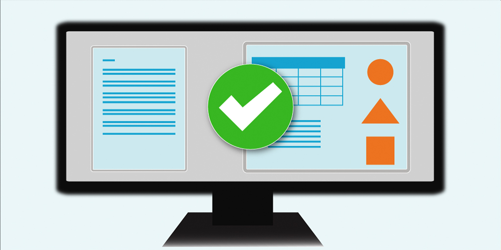
Making Documents Accessible
Accessibility is the practice of creating digital content that all people can perceive, understand, interact with, and navigate. Since so much, if not all, course content is provided to students digitally, it’s important to consider students’ physical, auditory, motor, and cognitive abilities when developing course materials to ensure that they are inclusive and accessible to all learners. (To understand what the experience is like for someone using assistive technology to read an inaccessible document, watch this short video.) Incorporating accessibility principles such as clear instructions, simple layouts, high-color contrast, and the availability of transcripts or captions benefits everyone and improves the stability of online content. Furthermore, the Institute is legally obligated to provide accessible materials to students.
How to Check a Document for Accessibility
Microsoft Word and Adobe Acrobat Pro have built-in tools to help ensure accessibility of documents for people with visual impairments (or other disabilities) that might require screen reader technology.
Word Accessibility Checker
Adobe Acrobat Pro Check Accessibility
Guidelines and Tips for Constructing Accessible Documents
There are several relatively simple ways to enhance the readability of documents for everyone.
- Use headings for hierarchy.
- Create accessible lists.
- Add alt text to visuals.
- Use accessible font formats and colors.
- Avoid tables used explicitly for layout.
Use headings for hierarchy.
Headings add structure and hierarchy to the text in documents. It allows visual readers to glance over a document and find information quickly. This same benefit should also be provided for non-sighted users by utilizing the application’s headings and style features. Assistive technologies have keyboard shortcuts that enable users to scan the document’s headings to find the topics they are interested in. Use the styles hierarchy to assign headings according to their order from the main heading (H1) to subheadings (H2, H3, etc.)
For step-by-step instructions on how to use headings and styles in different apps, go to:
- Word: Improve accessibility with heading styles.
- Pages: Apply paragraph styles
- Google Docs: Add a heading or title
Create accessible lists.
Ensure that you use the application’s list feature for bullets or numbers. Avoid manually typing bullets or numbers to mark items in a list.
Add alt text to images, diagrams, and charts.
Alternative text (alt text) helps people who can’t see the screen to understand what’s important in visual content. Visual content includes pictures, SmartArt graphics, shapes (or groups of shapes), charts, embedded objects, ink drawings, and videos. In alt text, briefly describe the image and mention its intent. Screen readers read the text to describe the image to users who can’t see the image. For more info on how to write alt text, go to Everything you need to know to write effective alt text.
For the step-by-step instructions on how to add alt text to a document, go to:
Tip: When images are meant to be only decorative and are not important to the meaning of the text, it is best practice to label them as “decorative.”
Use accessible font format and color.
Accessible fonts improve the legibility and readability of the document. In general, you should:
- Select familiar sans serif fonts such as Verdana, Arial, or Calibri.
- Avoid all-capital letters. (Screen readers interpret all caps as initials and therefore read the letters rather than the word as a whole.)
- Avoid excessive italics or underlining.
Additionally, someone with a vision disability might miss out on the meaning conveyed by particular colors.
- Use bright colors or high-contrast color schemes on opposite ends of the spectrum (e.g., Red/green color blindness is the most common, so avoid green on red or red on green).
- You may want to use a color analyzer for this task, such as TPGi Colour Contrast Analyzer, which has a color picker embedded in it, or you could use WebAIM or Adobe tools.
- Color should not be the only indicator for text elements. For example, underline links on hover, mark a required field with an asterisk, or provide emphasis with bolded text.
Avoid tables used explicitly for layout.
Tables-present data in a way that is easy to scan and make sense of visually. But viewing a table and having a table read by a screen reader are two vastly different experiences. Screen readers speak one cell at a time and reference the associated header cells so the reader doesn’t lose context. That means, for a table to be accessible, you will need to incorporate structural markers or tags (e.g., adding a table caption and identifying the header row).
- As a general rule, avoid using tables only for layout purposes.
- Associate column and row header cells with the column and row they reference.
- Avoid nested tables. If tables are being used for displaying data, then nested tables are rarely, if ever, needed.
- Avoid merged or split cells unless the authoring environment provides an accessible way of presenting these. HTML has colspan and rowspan attributes, so if these types of cells are necessary, consider coding your table in HTML.
- Add a table caption to your tables. HTML has the caption element for doing this; other environments may refer to table captions in alternate ways.
- Keep titles and footnote definitions separate from tables. They should either precede or follow.
- Do not use screenshots of tables, as screen readers can not read them.
For step-by-step instructions on how to make tables accessible in Word or Google Docs, go to
If you have questions or concerns about accessibility, the Disability and Access Services (DAS) office is available for consultations. Go to the DAS website or email accessibility@mit.edu. Additionally, when working with PDFs, DAS recommends two vendors to whom departments could outsource the accessibility remediation process:
Additional Resources for Creating Accessible Documents
Application-specific
From DAS
MIT-related accessibility materials
- Quick Tips for Online Content Accessibility
- MITx Instructional Support for videos
- Accessibility review checklist
External accessibility resources
- Teach Access – an industry consortium trying to promote usability in technology products.
- Teach Access Tutorial – an excellent overall tutorial on the basic concepts of accessibility.
- UX Foundations Accessibility – by Derek Featherstone (and LinkedIn Learning)
- Three dimensions of Inclusive Design by Jutta Treviranus
